
HSBC BankMobile Fusion app
Senior UX Designer
Defining a new direction beyond payments and deposits
How else could the app further enhance user productivity for SME owners
Overview
Mobile Fusion is an HSBC banking app designed for small business owners (SMEs) who manage both personal and business finances. Targeting HSBC Premier customers with companies of fewer than 10 employees, the app—currently piloted in Canada—enables users to check balances, deposit cheques, transfer money, and pay bills.
Taking the feedback from the Day 1 launch into consideration, there was a need to address a more tailored approach for the homepage in order to retain engagement from users.
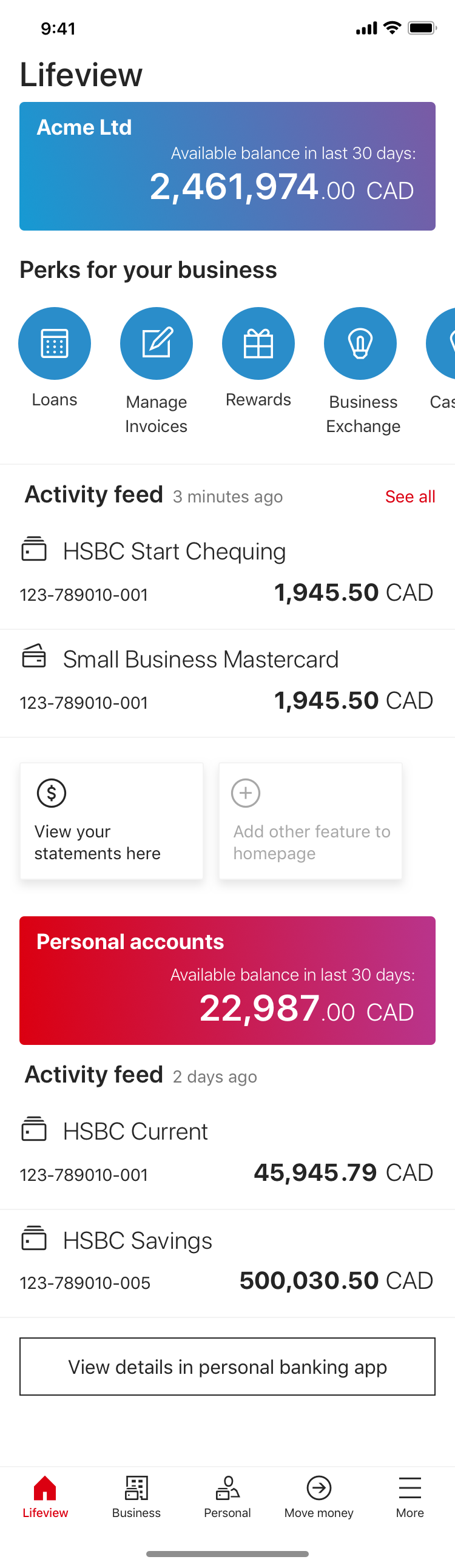
The key objective of this next stage was to transform the homepage from a passive balance-checker into an active tool that saves time and adds value for small business owners.
Role:
UX/UI Designer
User research
System audit
Prototyping
User testing
Usability testing
Team:
Product ownersBusiness analystSolution architectFull stack devs
Software tester
Local stakeholders
Duration:
3 months
- Discover
Research and feedback revealed these key issues:While the app provides essential transaction features, user feedback revealed dissatisfaction with the homepage, which only displays account balances and promotional banners. Small business owners want a more tailored experience, with quick access to relevant financial insights and tools—not just static information.
Redesign Goals
To build a homepage that works for busy business owners, not just the bank’s promotions. This means:
- Showing what matters most – like daily cash flow or upcoming bills, not just account numbers
- Making frequent tasks faster – quick access to things like transfers or deposits
- Getting rid of clutter – replacing generic ads with useful tools
- Testing real user needs – since this part hasn’t been validated yet (unlike the payment features)
User interviews
To gain an understanding of:
- what are the pain points of the current search function in the core banking app
- what ‘work around’ methods are being used to complete searches
- what are the end goals of each keyword search
Competitor analysis
- To gain an understanding of:how search is being executed in the competitive landscape
- how advanced features are being used in other products
User journey mapping
To gain an understanding of:
- users’ current pain points
- user’s needs, goals and motivations
- user’s touch points and interactions
So that I can:
- identify capabilities to further enhance the user experience to the product
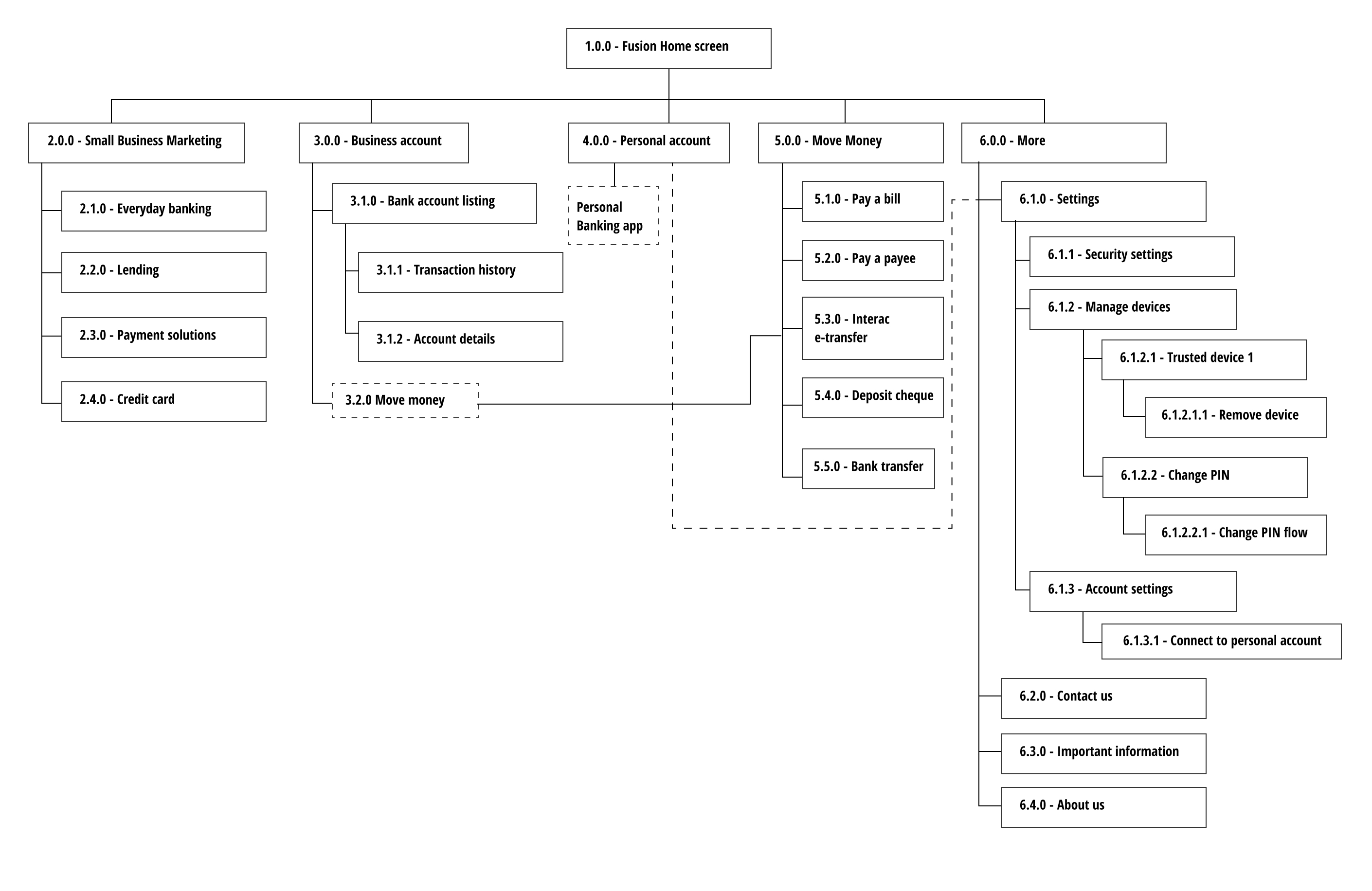
App mapping
To gain an understanding of:
- the information architecture and user flow to visualise how everything was connected
So that I can:
- identify disjointed navigation and gaps which would help shape the home page into something more useful
- Define
There were 3 problem areas which I managed to define:
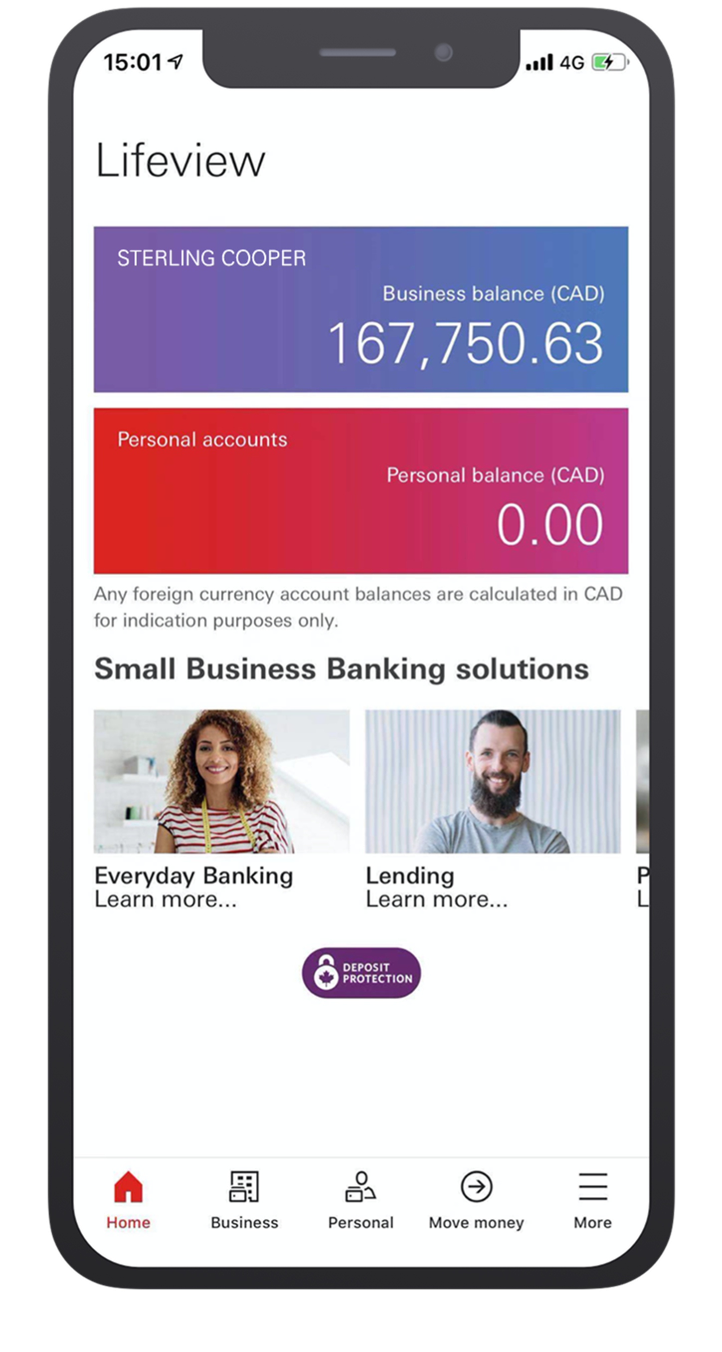
Misleading IA (Information Architecture) – The "Personal" and "Business" tabs were equally prominent, but functionality wasn’t balanced. This created confusion for users who expected there to be the same functionality for both sections
Problem #1
Homepage lacked personalisation. There were no short cuts to frequently used actions. ie. making payments, logging in and depositing cheques.
Problem #2
Lack of advanced billing features. Users weren’t able to pay bills in advance which is a big problem for SMEs whose priority is cash flow - being able to factor in ‘upcoming payments’ would be a game changer
Problem #3
Mobile Fusion account details screen flow
Displayed results grouped into categories: clients, authorities and positions.
- Develop
Based on research insights, I developed wireframes to explore various search refinement approaches.
Redesign approach 1:Homepage revamp
“I found the navigation menu a bit confusing—specifically, why the 'Personal' option was given the same level of importance as 'Business' when my personal account couldn’t do nearly as much.”
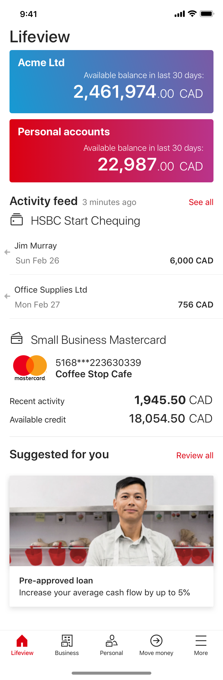
Homepage option 1Recent transactions upfront will encourage users to open the app more often and helps with cashflow planning
Homepage option 2Improved usability hierarchy and relevant shortcuts upfront will enable users to reach frequently performed actions more easily
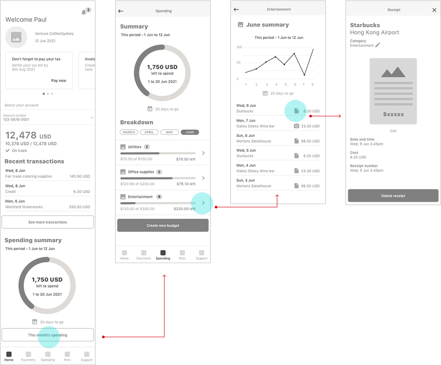
Redesign approach 2: Spending monitor
“If you could just have your phone look at your accounting software and make sure that deposits were made properly it would be nice and easy. It’s like an on-the-spot reconciliation.”
Budget tracker optionBills and expenses tracked in the same app with the possibility to integrate with other accounting software will users save time
Next steps
In order to move on with the development of this phase, I will take these proposals and conduct usability testing with SMEs to validate effectiveness before iterative refinement and development. This structured approach ensures the next evolution of Mobile Fusion aligns with real user needs while maintaining scalability.
HSBC BankMobile Fusion app
Senior UX Designer
Defining a new direction beyond payments and deposits
How else could the app further enhance user productivity for SME owners
Overview
Mobile Fusion is an HSBC banking app designed for small business owners (SMEs) who manage both personal and business finances. Targeting HSBC Premier customers with companies of fewer than 10 employees, the app—currently piloted in Canada—enables users to check balances, deposit cheques, transfer money, and pay bills.
Taking the feedback from the Day 1 launch into consideration, there was a need to address a more tailored approach for the homepage in order to retain engagement from users.
The key objective of this next stage was to transform the homepage from a passive balance-checker into an active tool that saves time and adds value for small business owners.
Role:
UX/UI Designer
User research
Prototyping
User testing
Usability testing
Team:
Product ownerDev leadFull stack devs
Software tester
Local stakeholders
Duration:
3 months
- Discover
Research and feedback revealed these key issues:While the app provides essential transaction features, user feedback revealed dissatisfaction with the homepage, which only displays account balances and promotional banners. Small business owners want a more tailored experience, with quick access to relevant financial insights and tools—not just static information.
Redesign Goals
To build a homepage that works for busy business owners, not just the bank’s promotions. This means:
- Showing what matters most – like daily cash flow or upcoming bills, not just account numbers
- Making frequent tasks faster – quick access to things like transfers or deposits
- Getting rid of clutter – replacing generic ads with useful tools
- Testing real user needs – since this part hasn’t been validated yet (unlike the payment features)
User interviews
To gain an understanding of:
- what is the feedback of the current features and how well were the features received
- what were the challenges with the main journeys
- what were the ultimate end goals for the users
Competitor analysis
To gain an understanding of:
- what are the expectations of business banking users in the competitive landscape
- how important it was to be able to see both personal and business banking balances in the same app
- industry standard patterns and gaps
App mapping
To gain an understanding of:
- the information architecture and user flow to visualise how everything was connected
So that I can:
- identify disjointed navigation and gaps which would help shape the home page into something more useful
- Define
Selecting main areas of focus for the homepage revamp based on the research and ideation phase:
Misleading IA (Information Architecture) – The "Personal" and "Business" tabs were equally prominent, but functionality wasn’t balanced. This created confusion for users who expected there to be the same functionality for both sections
Problem #1
Homepage lacked personalisation. There were no short cuts to frequently used actions. ie. making payments, logging in and depositing cheques.
Problem #2
Lack of advanced billing features. Users weren’t able to pay bills in advance which is a big problem for SMEs whose priority is cash flow - being able to factor in ‘upcoming payments’ would be a game changer
Problem #3
Mobile Fusion account details screen flow
Business accounts allow users to interact more with their accounts than personal ones
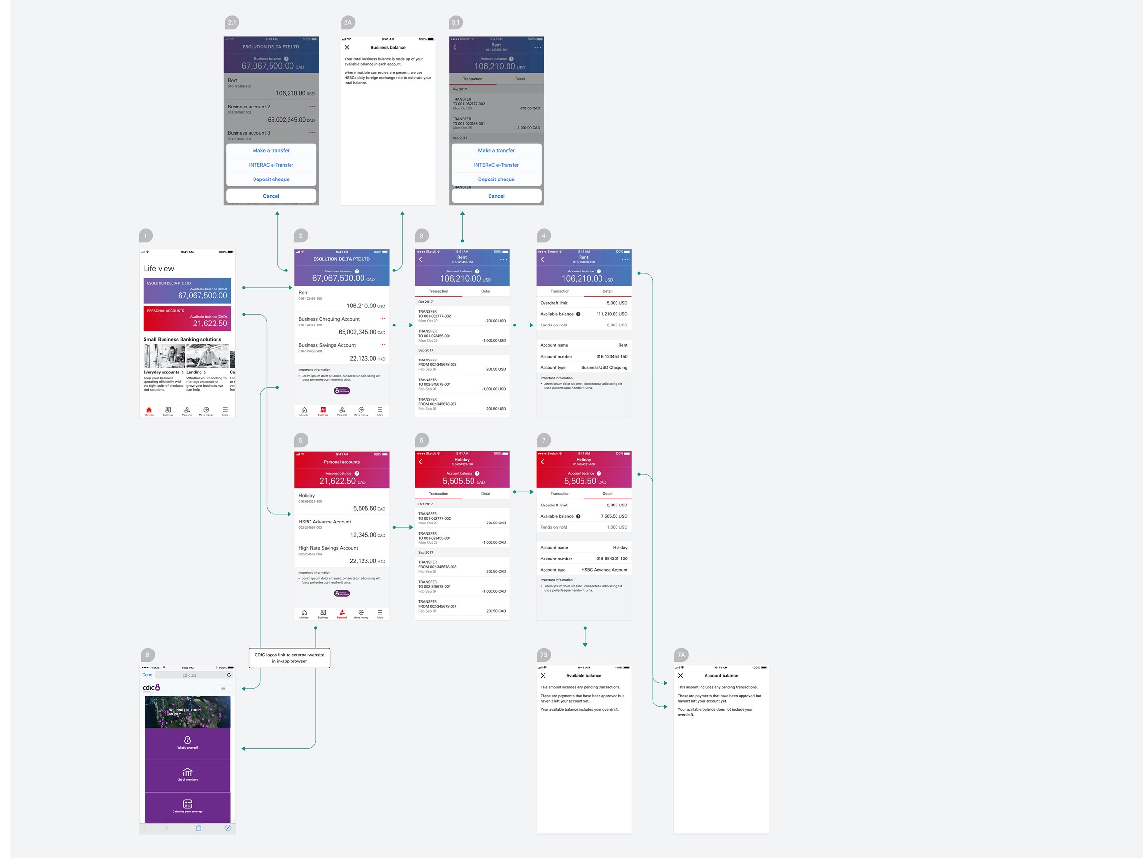
Personal accounts:View only screens
Business accounts:Users are able to make:
- Payments
- Transfers
- Cheque deposits


- Develop
Based on research insights, I developed wireframes to explore various refinement approaches.
Redesign approach 1: Homepage revamp
“I found the navigation menu a bit confusing—specifically, why the 'Personal' option was given the same level of importance as 'Business' when my personal account couldn’t do nearly as much.”
Homepage option 1Recent transactions upfront will encourage users to open the app more often and helps with cashflow planning
Homepage option 2Improved usability hierarchy and relevant shortcuts upfront will enable users to reach frequently performed actions more easily
Redesign approach 2: Spending monitor
“If you could just have your phone look at your accounting software and make sure that deposits were made properly it would be nice and easy. It’s like an on-the-spot reconciliation.”
Budget tracker optionBills and expenses tracked in the same app with the possibility to integrate with other accounting software will users save time
Next steps
In order to move on with the development of this phase, I will take these proposals and conduct usability testing with SMEs to validate effectiveness before iterative refinement and development. This structured approach ensures the next evolution of Mobile Fusion aligns with real user needs while maintaining scalability.
HSBC BankMobile Fusion app
Senior UX Designer
Defining a new direction beyond payments and deposits
How else could the app further enhance user productivity for SME owners
Overview
Mobile Fusion is an HSBC banking app designed for small business owners (SMEs) who manage both personal and business finances. Targeting HSBC Premier customers with companies of fewer than 10 employees, the app—currently piloted in Canada—enables users to check balances, deposit cheques, transfer money, and pay bills.
Taking the feedback from the Day 1 launch into consideration, there was a need to address a more tailored approach for the homepage in order to retain engagement from users.
The key objective of this next stage was to transform the homepage from a passive balance-checker into an active tool that saves time and adds value for small business owners.
Role:
UX/UI Designer
User research
Prototyping
User testing
Usability testing
Team:
Product ownerDev leadFull stack devs
Software tester
Local stakeholders
Duration:
3 months
- Discover
Research and feedback revealed these key issues:While the app provides essential transaction features, user feedback revealed dissatisfaction with the homepage, which only displays account balances and promotional banners. Small business owners want a more tailored experience, with quick access to relevant financial insights and tools—not just static information.
Redesign Goals
To build a homepage that works for busy business owners, not just the bank’s promotions. This means:
- Showing what matters most – like daily cash flow or upcoming bills, not just account numbers
- Making frequent tasks faster – quick access to things like transfers or deposits
- Getting rid of clutter – replacing generic ads with useful tools
- Testing real user needs – since this part hasn’t been validated yet (unlike the payment features)
User feedback
To gain an understanding of:
- what is the feedback of the current features and how well were the features received
- what were the challenges with the main journeys
- what were the ultimate end goals for the users
Competitor analysis
To gain an understanding of:
- what are the expectations of business banking users in the competitive landscape
- how important it was to be able to see both personal and business banking balances in the same app
- industry standard patterns and gaps
App mapping
To gain an understanding of:
- the information architecture and user flow to visualise how everything was connected
So that I can:
- identify disjointed navigation and gaps which would help shape the home page into something more useful
- Define
Selecting main areas of focus for the homepage revamp based on the research and ideation phase:
Problem #1
Misleading IA (Information Architecture) – The "Personal" and "Business" tabs were equally prominent, but functionality wasn’t balanced. This created confusion for users who expected there to be the same functionality for both sections
Problem #2
Homepage lacked personalisation. There were no short cuts to frequently used actions. ie. making payments, logging in and depositing cheques.
Problem #3
Lack of advanced billing features. Users weren’t able to pay bills in advance which is a big problem for SMEs whose priority is cash flow - being able to factor in ‘upcoming payments’ would be a game changer
Mobile Fusion account details screen flow
Users are allowed to interact more with their business accounts than their personal ones
Personal accounts:View only screens
Business accounts:Users are able to make:
- Payments
- Transfers
- Cheque deposits


- Develop
Based on research insights, I developed wireframes to explore various refinement approaches.
Redesign approach 1: Homepage revamp
“I found the navigation menu a bit confusing—specifically, why the 'Personal' option was given the same level of importance as 'Business' when my personal account couldn’t do nearly as much.”
Homepage option 1Recent transactions upfront will encourage users to open the app more often and helps with cashflow planning
Homepage option 2Improved usability hierarchy and relevant shortcuts upfront will enable users to reach frequently performed actions more easily
Redesign approach 2: Spending monitor
“If you could just have your phone look at your accounting software and make sure that deposits were made properly it would be nice and easy. It’s like an on-the-spot reconciliation.”
Budget tracker optionBills and expenses tracked in the same app with the possibility to integrate with other accounting software will save users book keeping time and will help with app engagement
Next steps
In order to move on with the development of this phase, I will take these proposals and conduct usability testing with SMEs to validate effectiveness before iterative refinement and development. This structured approach ensures the next evolution of Mobile Fusion aligns with real user needs while maintaining scalability.