
CoinFLEX crypto exchangeDashboard refresh
Senior UX Designer
Dashboard
Prioritising key data a glance, so users see what matters to them the most, right away.
Overview
CoinFLEX was a crypto derivatives exchange offering innovative products like flexUSD (the world’s first interest-bearing stablecoin) and AMM+ (a highly capital-efficient automated market maker). However, despite its advanced offerings, the three-year-old web app’s dashboard was underutilized—users weren’t engaging with key features due to unclear navigation and complex terminology.During the 2021 crypto boom, many investors were new to crypto and struggled with industry jargon. Additionally, exchanges had loyalty programs with unclear rules, leading users to ignore them. CoinFLEX’s dashboard needed a redesign to improve usability, educate users, and increase feature adoption.As the sole designer, I led the dashboard revamp, collaborating with a remote product team across Hong Kong and Shenzhen. My responsibilities included research, UX/UI design, and ensuring the new dashboard effectively communicated value to both novice and experienced traders.
Role:
UX/UI Designer
User research
System audit
Prototyping
User testing
Usability testing
Team:
Product ownersBusiness analystSolution architectFull stack devs
Software tester
Local topic owners
Duration:
5 months
- Discover
The existing dashboard—unchanged for three years—had become a pain point for users. Research and feedback revealed these key issues:
Alienating Terminology: Crypto-specific jargon confused newcomers, leading to high drop-off rates
Poor Relevance: The layout was rigid, forcing users to scroll past irrelevant, static information (e.g., setup prompts) to find actionable data
Redesign Goals
To address these problems, we focused on:
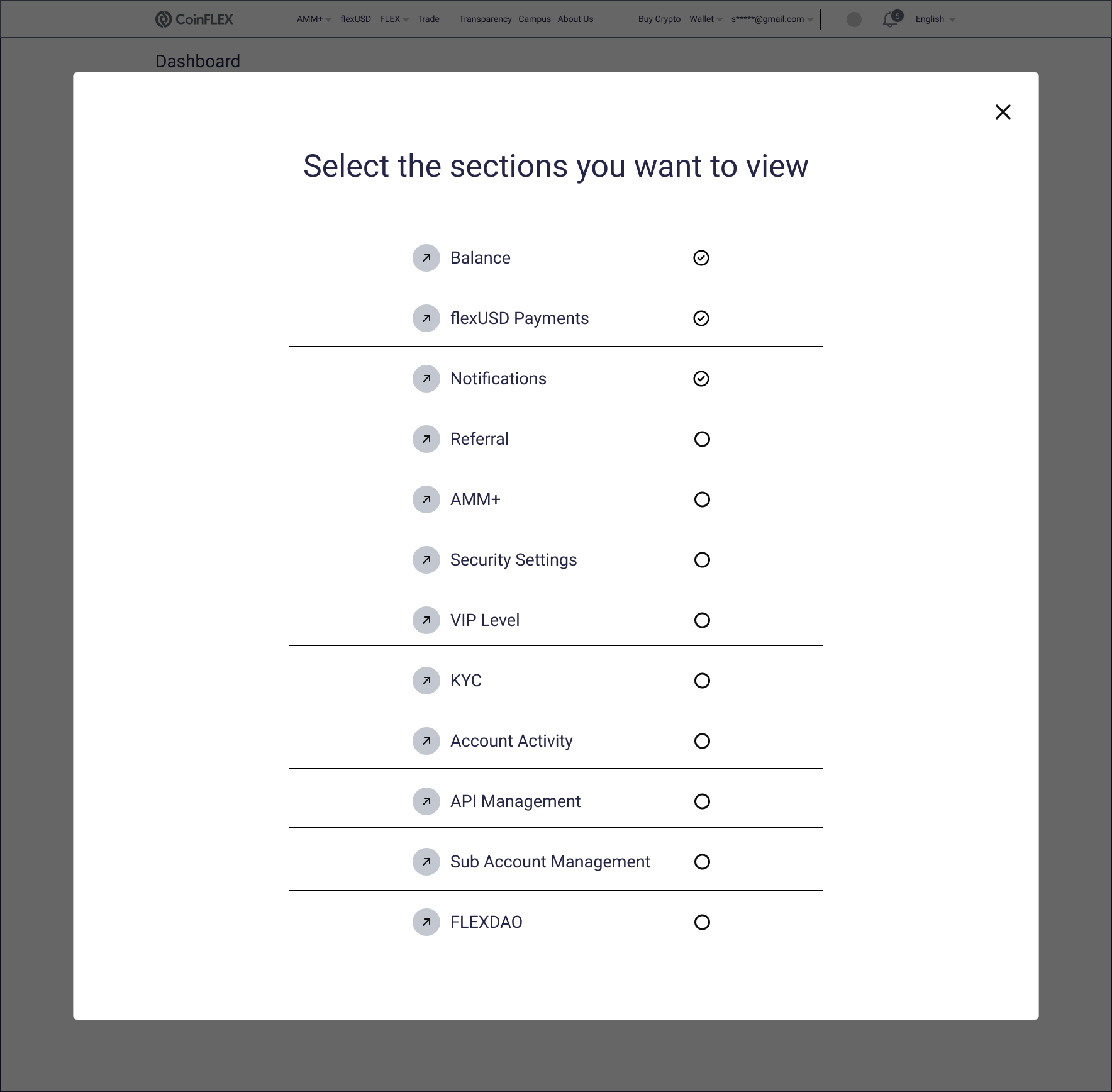
Prioritized Relevance: Letting users customise their view to see what matters most on entry
Feature Discovery: Surfacing new services (e.g., AMM+, flexUSD) in an accessible way to drive adoption
Visual Alignment: Reskinning the UI to match the new design system for consistency and trust
User interviews
To gain an understanding of:
- what are the pain points of the current dashboard for the users (novice to advanced)
- what ‘work around’ workflows are being used to navigate through the current dashboard
- what are the end goals of each visit
Competitor analysis
To gain an understanding of:
- how other dashboards are being executed in the competitive landscape
- what features are being included in other dashboards, along with its data hierarchy and feature promotions
Heuristic audit
To gain an understanding of:
- the existing dashboard and evaluate it against usability principles (eg. flexibility, clarity etc.)
So that I can:
- identify pain points to further enhance the user experience to the product
Card sorting
To gain an understanding of:
- what user’s priorities are when they look at the dashboard
- how familiar users are with the current dashboard vocabulary
Ideation brainstorm
To gather information on our learnings and brainstorm further improvements:
- what do we want to remove
- what do we want to keep
- what do we want to keep and improve
- what new ideas will improve the design and experience
- Define
There were 3 problem areas which I managed to define:
Not all users interact with the dashboard in one specific way, provide user the choice of being able to select areas of the dashboard they want to view in one go
Problem #1
Those who do use it, only concentrate on a particular section and then leave, introduce and educate other areas of the overall CoinFLEX eco-system to benefit new users
Problem #2
Some people find it useful but others rarely look at it, promote CoinFLEX’s star product, stablecoin flexUSD, by displaying historical and up-to-date yield rates
Problem #3
“I’d love to understand the benefits of the VIP program and the security settings seem a bit overwhelming. If there were clearer guidance, I’d feel much more confident using the platform.”
- Develop
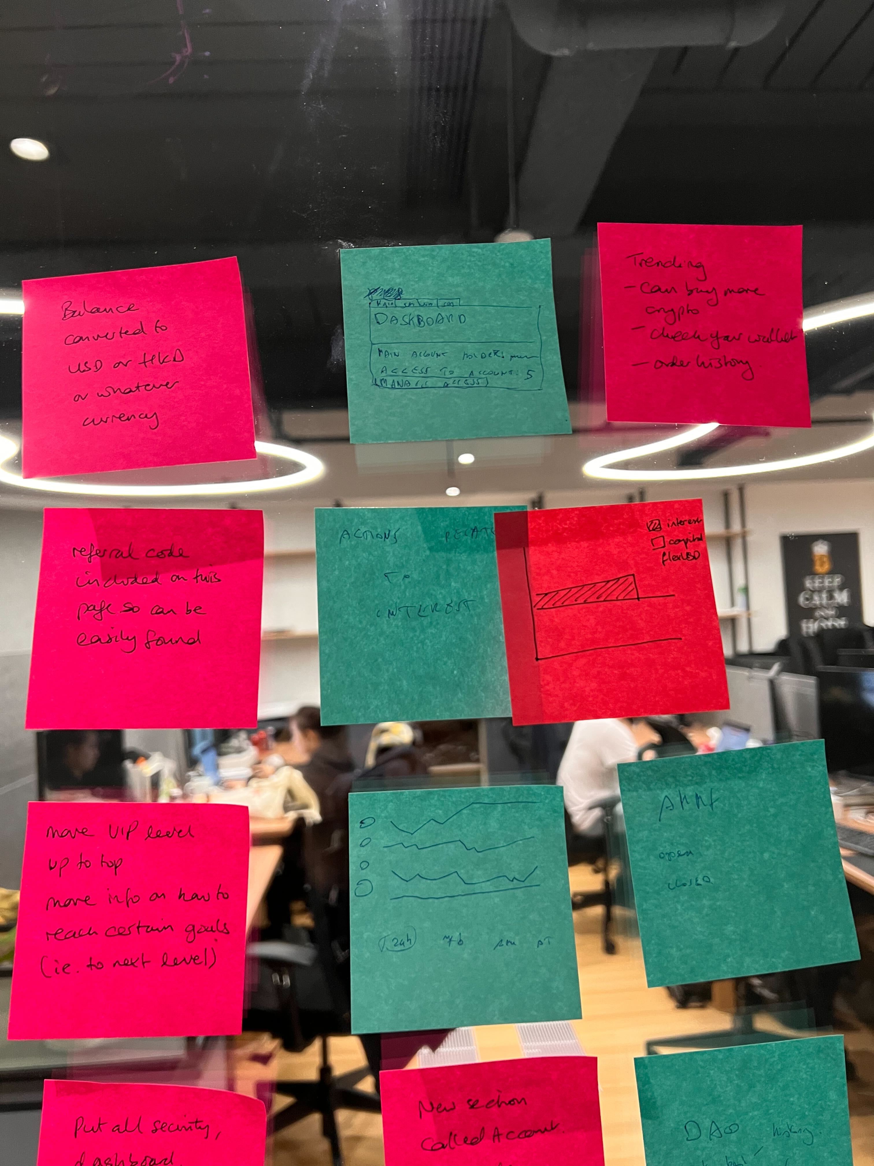
Based on research insights, I developed wireframes to explore various search refinement approaches and validated them through usability testing.
Pop-up navigation

Dropdown filter
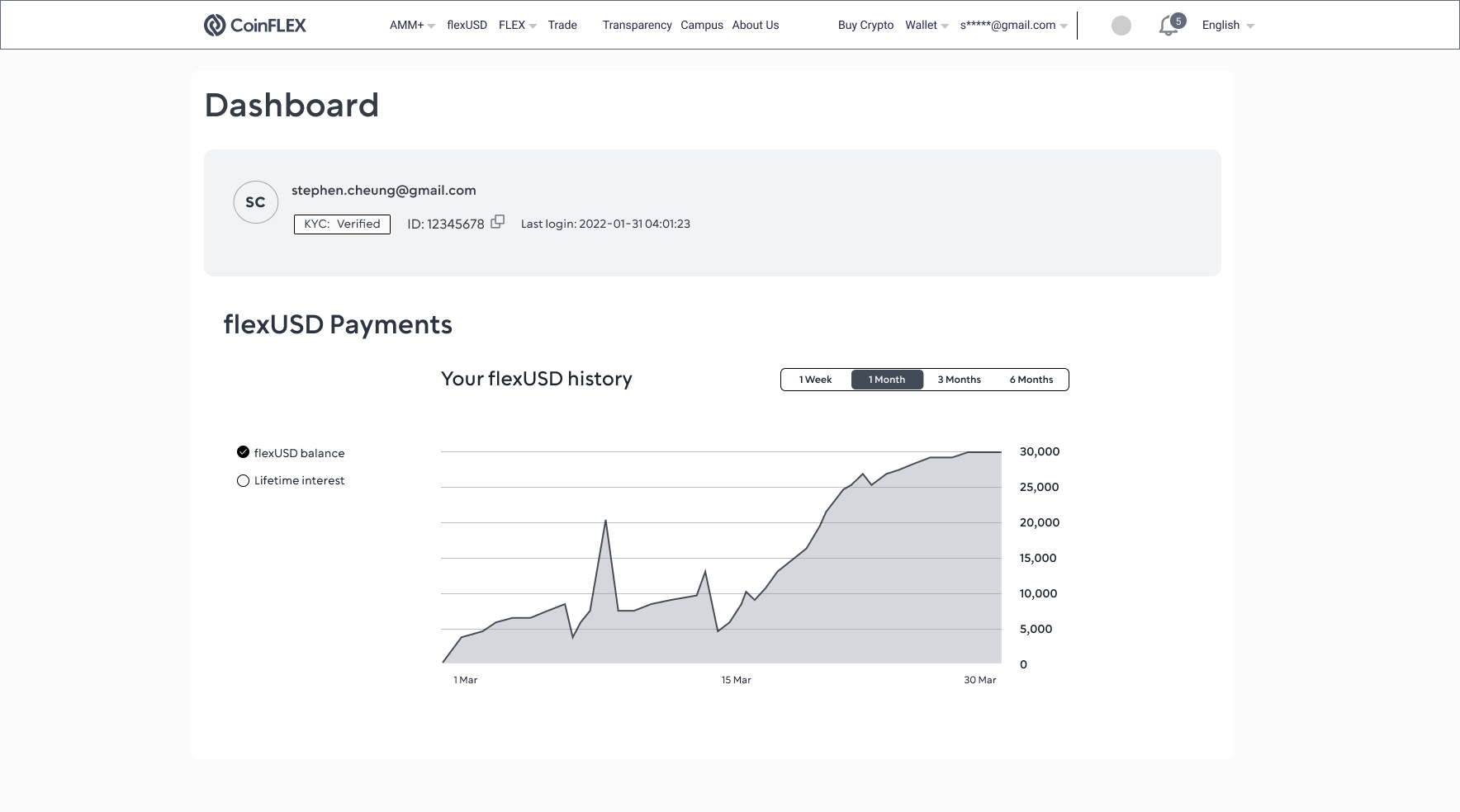
flexUSD balance
- Deliver
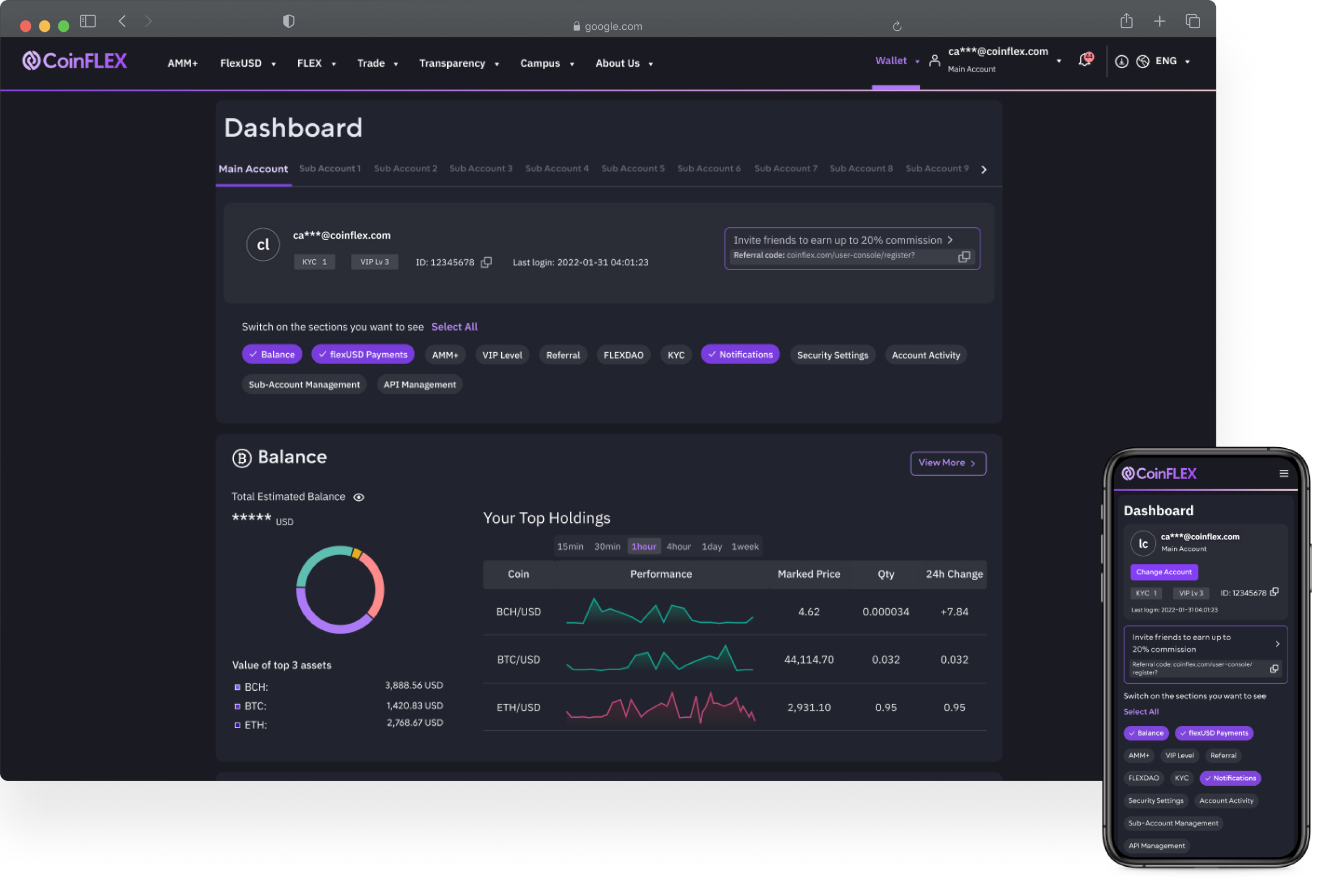
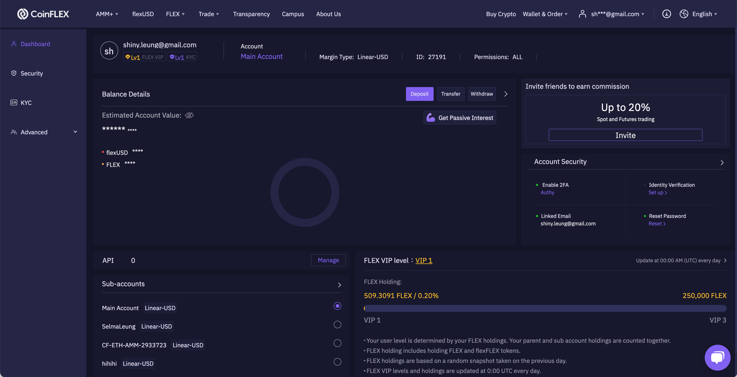
The final design of the CoinFLEX dashboard focuses on adaptability, ensuring that both new and experienced traders can interact with the platform in a way that suits their workflow—without overwhelming them.
Key Solutions Delivered
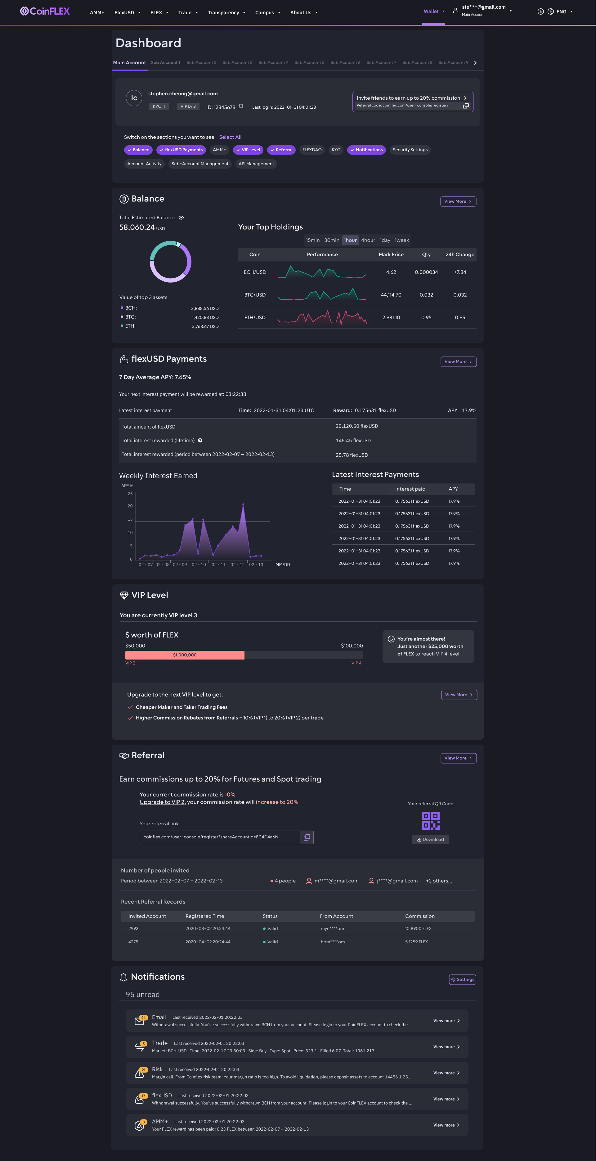
- Customisable Layouts
- Users can now rearrange and hide widgets (portfolio balance, VIP status, order history etc) based on their priorities.
- Impact: Day traders focus on real-time charts, while long-term holders emphasize portfolio performance—all in the same interface.
- Contextual VIP & Security Guidance
- Embedded tooltips explain VIP benefits (fee discounts, premium support) and security settings in plain language.
- Impact: Reduced confusion, with a 40% decrease in support tickets related to account setup.
- Unified but Flexible Navigation
- A dynamic quick-access toolbar (for frequent actions like deposits/trades) allows users to be able to toggle on and off sections as they wish
- Impact: Users reported faster task completion, whether executing trades or checking rewards.
Design Rationale
- User Segmentation: Research revealed three core interaction modes (analytical, transactional, passive monitoring). The dashboard supports all three without forcing a one-size-fits-all approach.
- Progressive Disclosure: Advanced features (e.g., margin trading) are accessible but tucked behind clear expansion panels to avoid clutter.
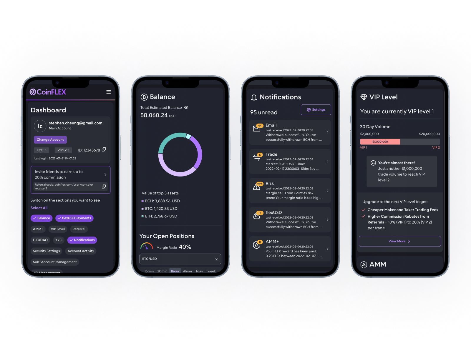
Mobile optimised layout
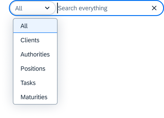
Displayed results grouped into categories: clients, authorities and positions.
Desktop: customised dashboard
40%
increase in users checking their flexUSD increase
15%
rise in reinvestments of flexUSD
25%
drop in related support tickets
2.5x
higher click-thru-rate
to view details pages
Regional design Adaptations:
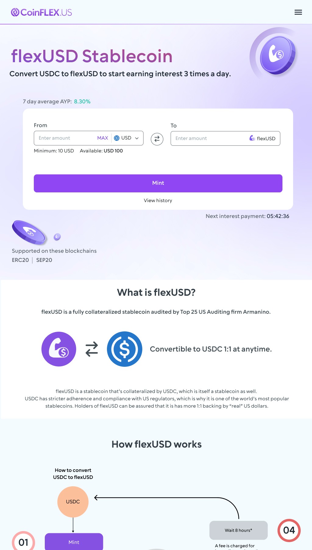
flexUSD Stablecoin page
A deep dive into CoinFLEX’s flagship product
flexUSD Stablecoin


Convert USDC to flexUSD to start earning interest 3 times a day.
What is flexUSD?
flexUSD is a fully collateralized stablecoin audited by Top 25 US Auditing firm Armanino.


Convertible to USDC 1:1 at anytime.
flexUSD is a stablecoin that’s collateralized by USDC, which is itself a stablecoin as well. USDC has stricter adherence and compliance with US regulators, which is why it is one of the world’s most popular stablecoins. Holders of flexUSD can be assured that it is has more 1:1 backing by “real” US dollars.
7 day average AYP: 8.30%
To
Enter amount
Minimum: 10 USD
Available: USD 100


flexUSD
Mint
View history
From
Enter amount
MAX


USD

Next interest payment: 05:42:36


ERC20
Supported on these blockchains
SEP20

flexUSD Stablecoin page
A deep dive into CoinFLEX’s flagship product
CoinFLEX crypto exchangeDashboard refresh
Senior UX Designer
Dashboard
Prioritising key data at a glance, so users see what matters to them the most right away
Overview
CoinFLEX was a crypto derivatives exchange offering innovative products like flexUSD (the world’s first interest-bearing stablecoin) and AMM+ (a highly capital-efficient automated market maker). However, despite its advanced offerings, the three-year-old web app’s dashboard was underutilized—users weren’t engaging with key features due to unclear navigation and complex terminology.During the 2021 crypto boom, many investors were new to crypto and struggled with industry jargon. Additionally, exchanges had loyalty programs with unclear rules, leading users to ignore them. CoinFLEX’s dashboard needed a redesign to improve usability, educate users, and increase feature adoption.As the sole designer, I led the dashboard revamp, collaborating with a remote product team across Hong Kong and Shenzhen. My responsibilities included research, UX/UI design, and ensuring the new dashboard effectively communicated value to both novice and experienced traders.
Role:
UX/UI Designer
User research
System audit
Prototyping
User testing
Usability testing
Team:
Product ownersSolution architectFull stack devs
Software tester
Duration:
5 months
- Discover
The existing dashboard—unchanged for three years—had become a pain point for users. Research and feedback revealed these key issues:
- Alienating Terminology: Crypto-specific jargon confused newcomers, leading to high drop-off rates
- Poor Relevance: The layout was rigid, forcing users to scroll past irrelevant, static information (e.g., setup prompts) to find actionable data
Redesign Goals
To address these problems, we focused on:
- Prioritized Relevance: Letting users customize their view to see what matters most on entry
- Feature Discovery: Surfacig new services (e.g., AMM+, flexUSD) in an accessible way to drive adoption
- Visual Alignment: Reskinning the UI to match the new design system for consistency and trust
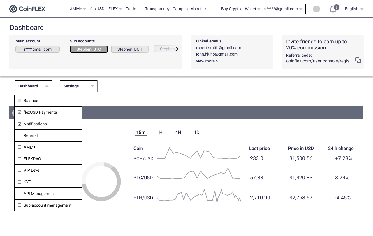
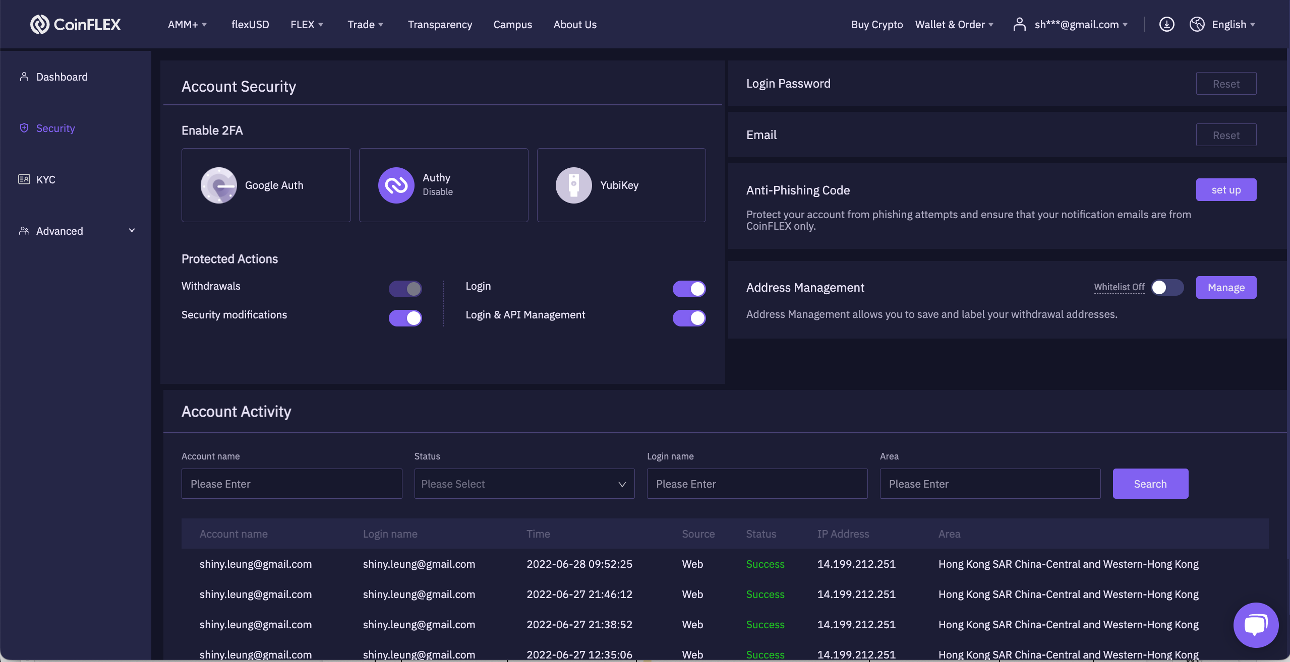
Previous dashboard - dashboard landing page
Previous dashboard - security settings
User interviews
To gain an understanding of:
- what are the pain points of the current dashboard for the users (novice to advanced)
- what ‘work around’ workflows are being used to navigate through the current dashboard
- what are the end goals of each visit
Competitor analysis
To gain an understanding of:
- how other dashboards are being executed in the competitive landscape
- what features are being included in other dashboards, along with its data hierarchy and feature promotions
Heuristic audit
To gain an understanding of:
- the existing dashboard and evaluate it against usability principles (eg. flexibility, clarity etc.)
So that I can:
- identify pain points to further enhance the user experience to the product
Card sorting
To gain an understanding of:
- what user’s priorities are when they look at the dashboard
- how familiar users are with the current dashboard vocabulary
Ideation brainstorm
To gather information on our learnings and brainstorm further improvements:
- what do we want to remove
- what do we want to keep
- what do we want to keep and improve
- what new ideas will improve the design and experience
- Define
Selecting main areas of focus based on the research and ideation phase:
Not all users interact with the dashboard in one specific way, provide user the choice of being able to select areas of the dashboard they want to view in one go
Problem #1
Those who do use it, only concentrate on a particular section and then leave, introduce and educate other areas of the overall CoinFLEX eco-system to benefit new users
Problem #2
Some people find it useful but others rarely look at it, promote CoinFLEX’s star product, stablecoin flexUSD, by displaying historical and up-to-date yield rates
Problem #3
“I’d love to understand the benefits of the VIP program and the security settings seem a bit overwhelming. If there were clearer guidance, I’d feel much more confident using the platform.”
- Develop
Based on research insights, I developed wireframes to explore various search refinement approaches and validated them through usability testing.
Pop-up navigation
Dropdown filter
flexUSD balance
- Deliver
The final design of the CoinFLEX dashboard focuses on adaptability, ensuring that both new and experienced traders can interact with the platform in a way that suits their workflow—without overwhelming them.
Key Solutions Delivered
- Customisable Layouts
- Users can now rearrange and hide widgets (portfolio balance, VIP status, order history etc) based on their priorities.
- Impact: Day traders focus on real-time charts, while long-term holders emphasize portfolio performance—all in the same interface.
- Contextual VIP & Security Guidance
- Embedded tooltips explain VIP benefits (fee discounts, premium support) and security settings in plain language.
- Impact: Reduced confusion, with a 40% decrease in support tickets related to account setup.
- Unified but Flexible Navigation
- A dynamic quick-access toolbar (for frequent actions like deposits/trades) allows users to be able to toggle on and off sections as they wish
- Impact: Users reported faster task completion, whether executing trades or checking rewards.
Design Rationale
- User Segmentation: Research revealed three core interaction modes (analytical, transactional, passive monitoring). The dashboard supports all three without forcing a one-size-fits-all approach.
- Progressive Disclosure: Advanced features (e.g., margin trading) are accessible but tucked behind clear expansion panels to avoid clutter.
Mobile optimised layout
Various screens of the responsive design
Desktop: customised dashboard
40%
increase in users checking their flexUSD increase
15%
rise in reinvestments of flexUSD
25%
drop in related support tickets
2.5x
higher click-thru-rate
to view details pages
Regional design adaptations:
flexUSD Stablecoin page
A deep dive into CoinFLEX’s flagship product
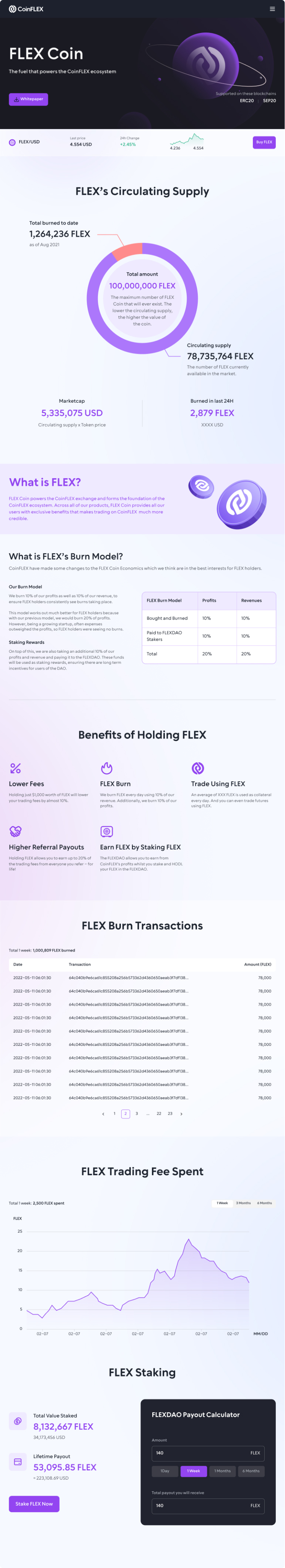
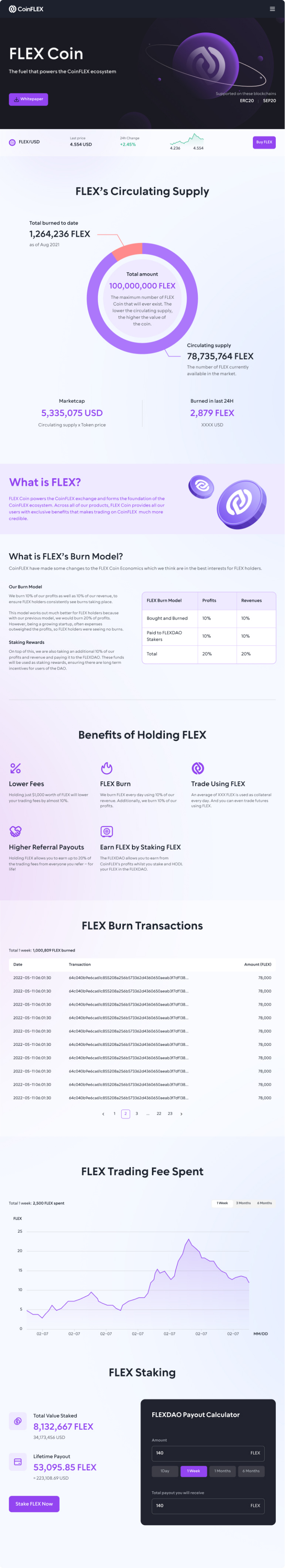
FLEX Coin page
CoinFLEX’s crypto token landing page

40%
increase in users checking their flexUSD increase
25%
drop in related support tickets
15%
rise in reinvestments of flexUSD
2.5x
higher click-thru-rate
to view details pages
Regional Design Adaptations:
40%
increase in users checking their flexUSD increase
25%
drop in related support tickets
15%
rise in reinvestments of flexUSD
2.5x
higher click-thru-rate
to view details pages
Regional Design Adaptations:
CoinFLEX crypto exchangeDashboard refresh
Senior UX Designer
Dashboard
Prioritising key data at a glance, so users see what matters to them the most right away
Overview
CoinFLEX was a crypto derivatives exchange offering innovative products like flexUSD (the world’s first interest-bearing stablecoin) and AMM+ (a highly capital-efficient automated market maker). However, despite its advanced offerings, the three-year-old web app’s dashboard was underutilized—users weren’t engaging with key features due to unclear navigation and complex terminology.During the 2021 crypto boom, many investors were new to crypto and struggled with industry jargon. Additionally, exchanges had loyalty programs with unclear rules, leading users to ignore them. CoinFLEX’s dashboard needed a redesign to improve usability, educate users, and increase feature adoption.As the sole designer, I led the dashboard revamp, collaborating with a remote product team across Hong Kong and Shenzhen. My responsibilities included research, UX/UI design, and ensuring the new dashboard effectively communicated value to both novice and experienced traders.
Role:
UX/UI Designer
User research
System audit
Prototyping
User testing
Usability testing
Team:
Product ownersSolution architectFull stack devs
Software tester
Duration:
5 months
- Discover
The existing dashboard—unchanged for three years—had become a pain point for users. Research and feedback revealed these key issues:
- Alienating Terminology: Crypto-specific jargon confused newcomers, leading to high drop-off rates
- Poor Relevance: The layout was rigid, forcing users to scroll past irrelevant, static information (e.g., setup prompts) to find actionable data
Redesign Goals
To address these problems, we focused on:
- Prioritized Relevance: Letting users customize their view to see what matters most on entry
- Feature Discovery: Surfacig new services (e.g., AMM+, flexUSD) in an accessible way to drive adoption
- Visual Alignment: Reskinning the UI to match the new design system for consistency and trust
Previous dashboard - dashboard landing page
Previous dashboard - security settings
User interviews
To gain an understanding of:
- what are the pain points of the current dashboard for the users (novice to advanced)
- what ‘work around’ workflows are being used to navigate through the current dashboard
- what are the end goals of each visit
Competitor analysis
To gain an understanding of:
- how other dashboards are being executed in the competitive landscape
- what features are being included in other dashboards, along with its data hierarchy and feature promotions
Heuristic audit
To gain an understanding of:
- the existing dashboard and evaluate it against usability principles (eg. flexibility, clarity etc.)
So that I can:
- identify pain points to further enhance the user experience to the product
Card sorting
To gain an understanding of:
- what user’s priorities are when they look at the dashboard
- how familiar users are with the current dashboard vocabulary
Ideation brainstorm
To gather information on our learnings and brainstorm further improvements:
- what do we want to remove
- what do we want to keep
- what do we want to keep and improve
- what new ideas will improve the design and experience
- Define
Selecting main areas of focus based on the research and ideation phase:
Problem #1
Not all users interact with the dashboard in one specific way, provide user the choice of being able to select areas of the dashboard they want to view in one go
Problem #2
Those who do use it, only concentrate on a particular section and then leave, introduce and educate other areas of the overall CoinFLEX eco-system to benefit new users
Problem #3
Some people find it useful but others rarely look at it, promote CoinFLEX’s star product, stablecoin flexUSD, by displaying historical and up-to-date yield rates
“I’d love to understand the benefits of the VIP program and the security settings seem a bit overwhelming. If there were clearer guidance, I’d feel much more confident using the platform.”
- Develop
Based on research insights, I developed wireframes to explore various search refinement approaches and validated them through usability testing.
Pop-up navigation

Dropdown filter
flexUSD balance
- Deliver
The final design of the CoinFLEX dashboard focuses on adaptability, ensuring that both new and experienced traders can interact with the platform in a way that suits their workflow—without overwhelming them.
Key Solutions Delivered
- Customisable Layouts
- Users can now rearrange and hide widgets (portfolio balance, VIP status, order history etc) based on their priorities.
- Impact: Day traders focus on real-time charts, while long-term holders emphasize portfolio performance—all in the same interface.
- Contextual VIP & Security Guidance
- Embedded tooltips explain VIP benefits (fee discounts, premium support) and security settings in plain language.
- Impact: Reduced confusion, with a 40% decrease in support tickets related to account setup.
- Unified but Flexible Navigation
- A dynamic quick-access toolbar (for frequent actions like deposits/trades) allows users to be able to toggle on and off sections as they wish
- Impact: Users reported faster task completion, whether executing trades or checking rewards.
Design Rationale
- User Segmentation: Research revealed three core interaction modes (analytical, transactional, passive monitoring). The dashboard supports all three without forcing a one-size-fits-all approach.
- Progressive Disclosure: Advanced features (e.g., margin trading) are accessible but tucked behind clear expansion panels to avoid clutter.
Mobile optimised layout
Various screens of the responsive design
Desktop: customised dashboard
40%
increase in users checking their flexUSD increase
15%
rise in reinvestments of flexUSD
25%
drop in related support tickets
2.5x
higher click-thru-rate
to view details pages
Regional design adaptations:
flexUSD Stablecoin page
A deep dive into CoinFLEX’s flagship product
FLEX Coin page
CoinFLEX’s crypto token landing page
40%
increase in users checking their flexUSD increase
25%
drop in related support tickets
15%
rise in reinvestments of flexUSD
2.5x
higher click-thru-rate
to view details pages
Regional Design Adaptations: